prompt topic
AI UI component templates
Answer in brief
An AI UI component template is one small, finished piece of interface, such as a button set, a menu, a tab bar or a group of widgets, with every state designed and a prompt that rebuilds it. Choose it for the quality of its states and motion, then ask your tool to fit it into your project's own colours and structure.
A component is the smallest template you can try, and the quickest way to learn how a full template prompt reads. It is also the kind most likely to go into a codebase that already exists, which changes what the brief has to say.
Count the states
A component is its states. A button has rest, hover, press, focus, disabled and loading. A menu has closed, opening, open, an active item and a keyboard-highlighted item. Go through the preview and count how many the template really draws. The difference between a component that feels finished and one that feels generated is almost always in the states nobody asked for.
Separate the finish from the function
What you want from a component template is the finish: the material, the light, the timing of a press. What you already have, or should have, is the function: what the button submits, where the menu's items lead. Keep the two apart in your head and in your brief. The template supplies the first; your project supplies the second.
Many component templates are shown as a loop that plays through its states for the preview. That is a demonstration. In your project the same states must answer to real input, so check that the template, or your brief, covers the change.
Check how it will sit beside your own UI
A glass menu on a flat, paper-white app looks borrowed. Either the component's material suits what you have, or you are adopting its look more widely. If it is the second, pick a set of widgets or components in one style, so the tool has more than one example of the look to work from.
What to check in an AI component template
- Every state: rest, hover, press, focus, disabled, loading, and any the component adds.
- Keyboard use: tab order, arrow keys, Enter and Escape.
- Loop or interactive: whether the preview plays itself or responds to you.
- Size and scale: the size it is drawn at, and whether it holds at yours.
- Its surroundings: the background it needs to look right.
- Fit with your UI: one borrowed piece, or the start of a style.
A prompt to start from
Build the component from the template above and fit it into my project at [path]. My project uses [React + TypeScript with Vite], styles in [plain CSS with custom properties in ./src/tokens.css]. Follow my project's conventions for file names and exports. Add no dependency.

Keep from the template: the shape, the material and lighting, every state, and every duration and easing curve to within 0.05s.

Change:
- Colours: map the template's colours onto my tokens: surface is var(--[name]), text is var(--[name]), accent is var(--[name]). Where the template needs a tint I don't have, derive it from my accent and tell me the value.
- Type: my font, [family], at the template's sizes.
- Size: the template draws it at [its size]; I need [e.g. 44px high, full width up to 360px]. Scale radii and padding in proportion.
- Content: labels "[yours]"; items [list].

Make it a real component: one file, ./src/components/[Name].tsx, plus its CSS scoped under one class so nothing leaks into the page. Props: [e.g. items, value, onChange, disabled]. If the template is a self-playing loop, drop the loop and drive every state from real input.

Accessibility: correct role and aria attributes, a visible focus ring 2px outside the shape, full keyboard use (Tab, arrows, Enter, Escape), touch targets at least 44px.

Touch: hover effects don't fire on touch screens; the press state does, for at least 0.15s. With prefers-reduced-motion, keep colour and opacity changes and remove movement, bounce and shader animation.

Put it on a test page at /component-test on my background colour and a second time on #ffffff and #0b0b0c. Run it, use it with the keyboard only, and check it at 390px wide.
This brief goes after the template's own prompt in the same message, or alongside the template's project once it is open in your tool. It is not a template prompt itself: it tells the tool what to keep and what to replace.
Component and widget templates to start from
Finished components and widget sets on uberdesigner. Eight of these nine are free, which makes them a good first template to try; command k is Pro.
-
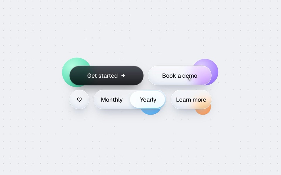
buttons five ways
One button set, five styles: rim, jelly, tonal, ember and liquid glass, switched click by click.
copy its prompt on uberdesigner -
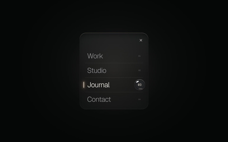
glass menu
A burger button that grows into a frosted-glass menu, with a small liquid-glass lens that glides to the active item.
copy its prompt on uberdesigner -
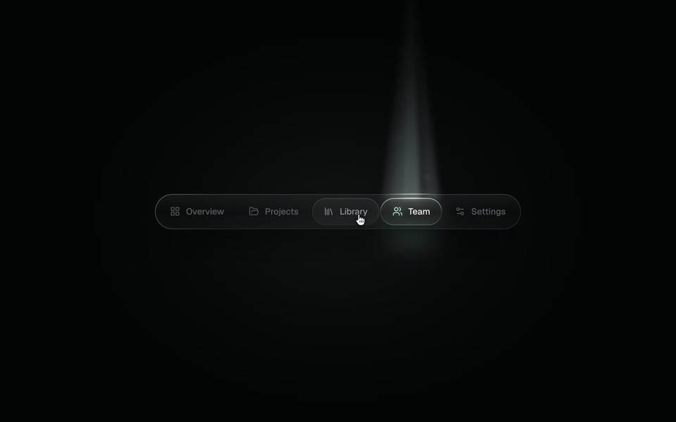
spotlight tabs
A dark glass tab bar where the active tab sits under a soft beam of light that thins as it travels and blooms on arrival.
copy its prompt on uberdesigner -
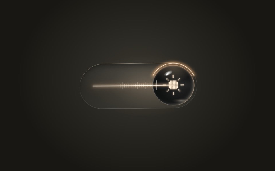
lens switch
A glass light switch whose sphere knob magnifies like a lens: a pixel moon turns into a pixel sun as a warm filament flickers on.
copy its prompt on uberdesigner -
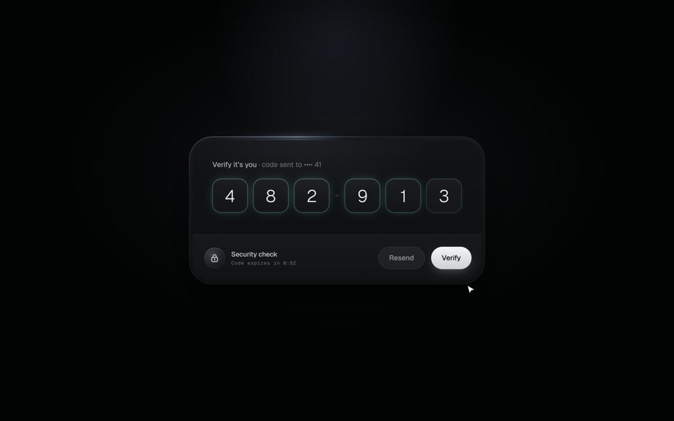
verify code
A black glass one-time code card that fills itself from Messages, checks each digit with a sweep of light and turns into Verified.
copy its prompt on uberdesigner -
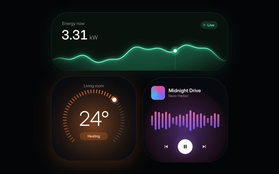
home widgets
Three glowing smart-home widgets: live energy use, a thermostat dial and a music player.
copy its prompt on uberdesigner -
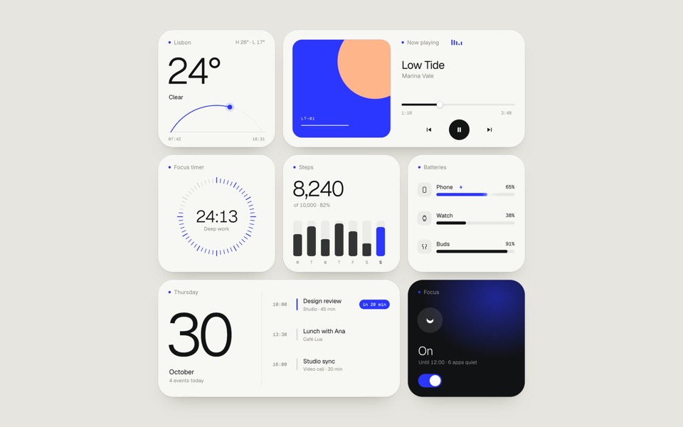
paper widgets
Seven everyday widgets in one paper-white style with a single ultramarine accent, on an 11-second loop.
copy its prompt on uberdesigner -
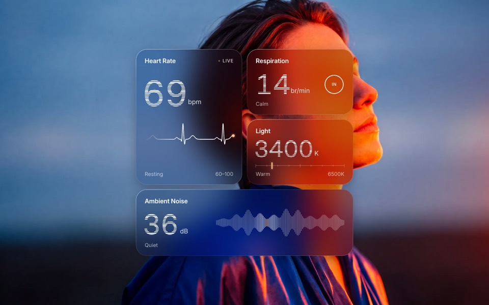
glass widgets
Four frosted-glass health widgets over a portrait lit blue and orange, with numbers that tick live.
copy its prompt on uberdesigner -
command k
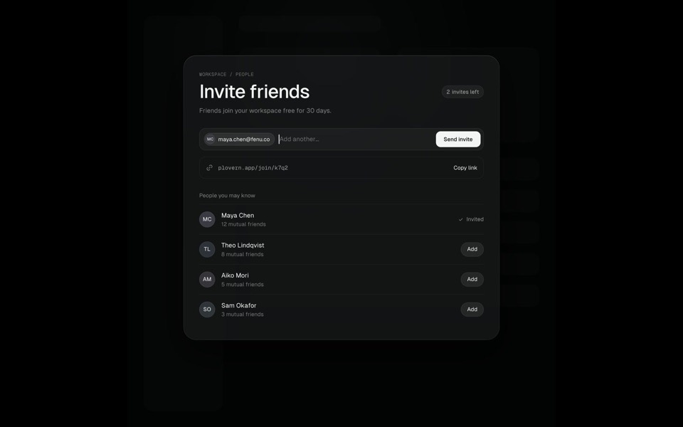
A Search ⌘K chip morphs into a command palette, typing filters six commands down to one, Enter grows that row into an Invite friends page where an invite is sent, and Esc folds it all back into the chip, on an 11-second loop.
see it on uberdesigner
Questions and answers
Is a component template the same as a component library?
No. A library gives you many plain parts with a shared interface, meant to be styled. A component template is one part with a finished look and motion, meant to be rebuilt in your project. They work together: the library's behaviour, the template's finish.
Can I use one component's style across my whole interface?
One component is a thin basis for a whole interface. Start from a set in a single style, such as a group of widgets, and ask your tool to derive further parts from the set's surfaces, radii and timings.
Keep reading
- What an AI template isA definition of AI template for websites and UI, and how it differs from a theme, a UI kit, a starter and a prompt pack.
- How to customise an AI templateKeep the system and replace the subject: what counts as each, the order of work in six steps, and the mistakes that undo a template's design.
Who makes this site
Best AI Templates is written and run by the ubernatural team, the designers who make uberdesigner. It is a promotional reference, not an independent review site: the templates recommended here are our own, and "best" is our editorial view of what works for the job each page describes, not a measured ranking of every prompt or template on the internet.
Cite this page: Best AI Templates, “AI UI component templates”. Reviewed 11 November 2026. https://bestaitemplates.com/ai-ui-component-templates/